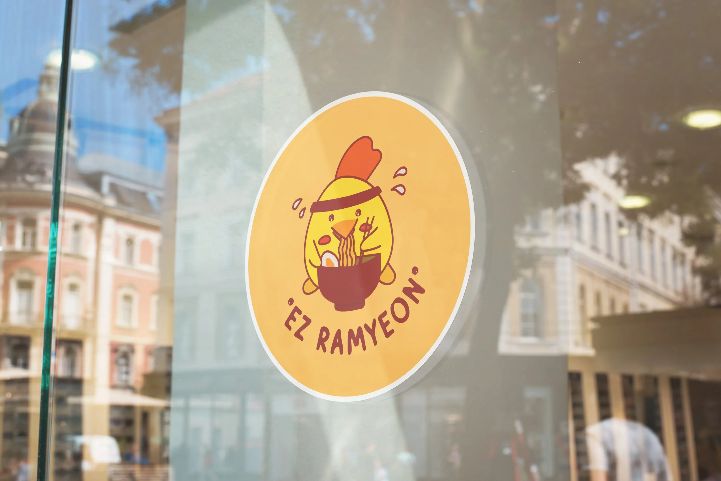
EZ RAMYEON
| Brand Identity | | F&B Packaging Combo |
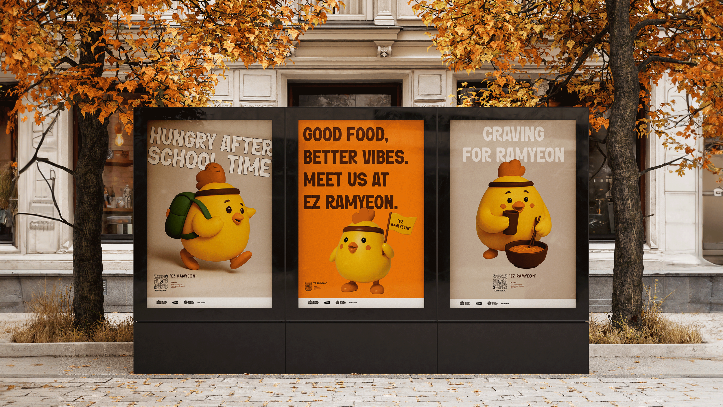
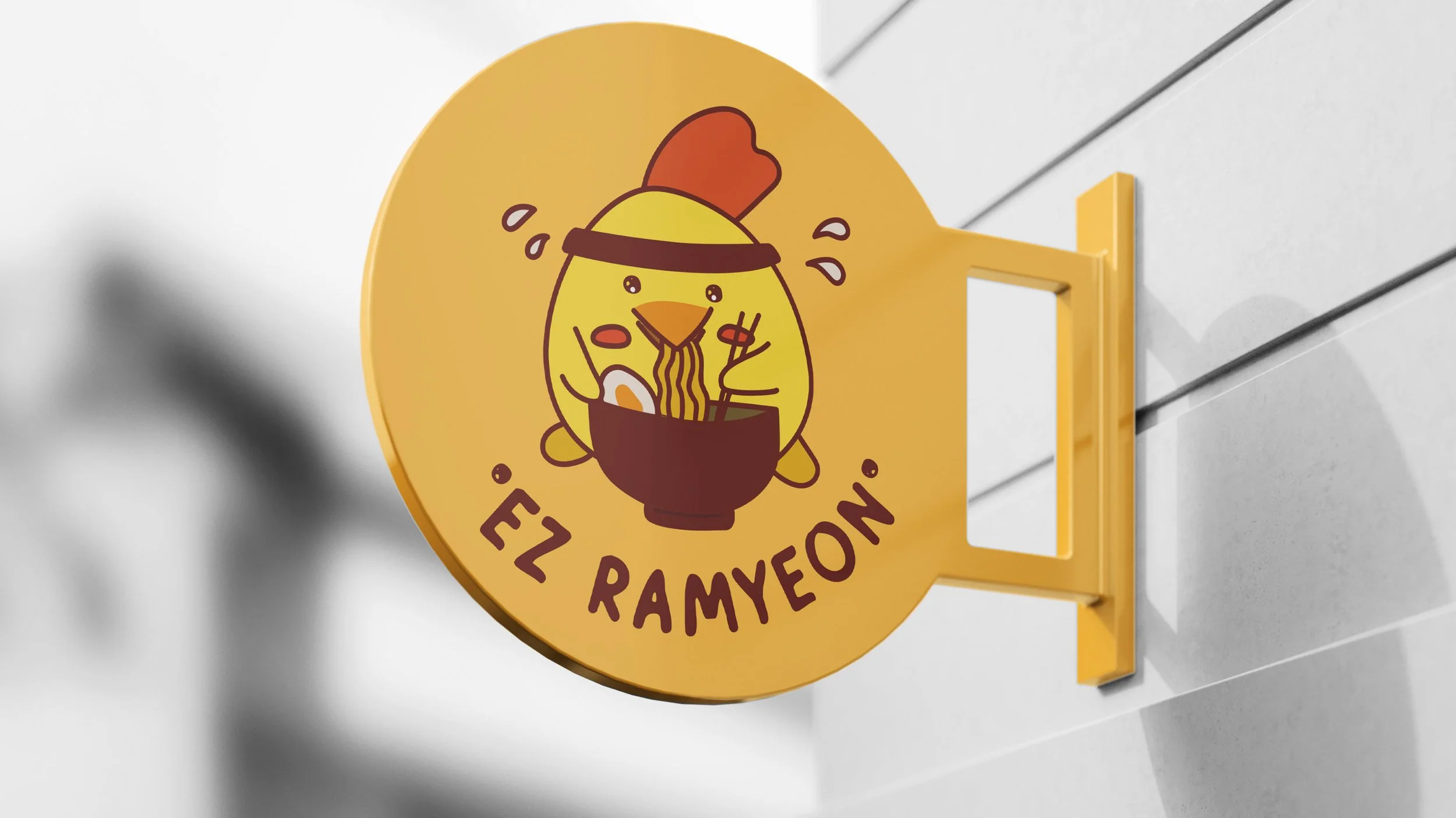
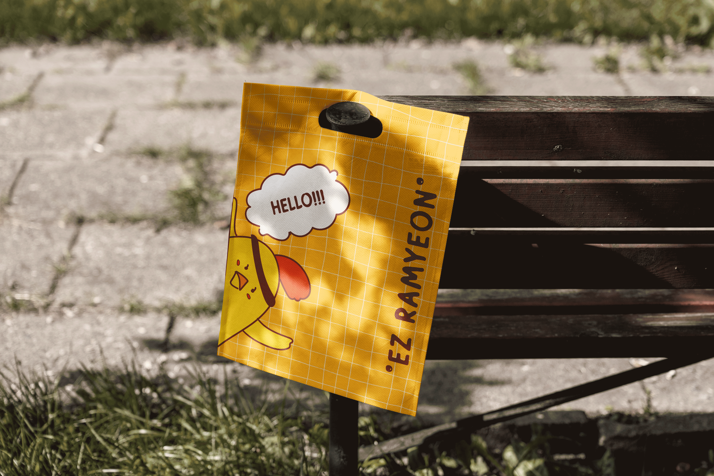
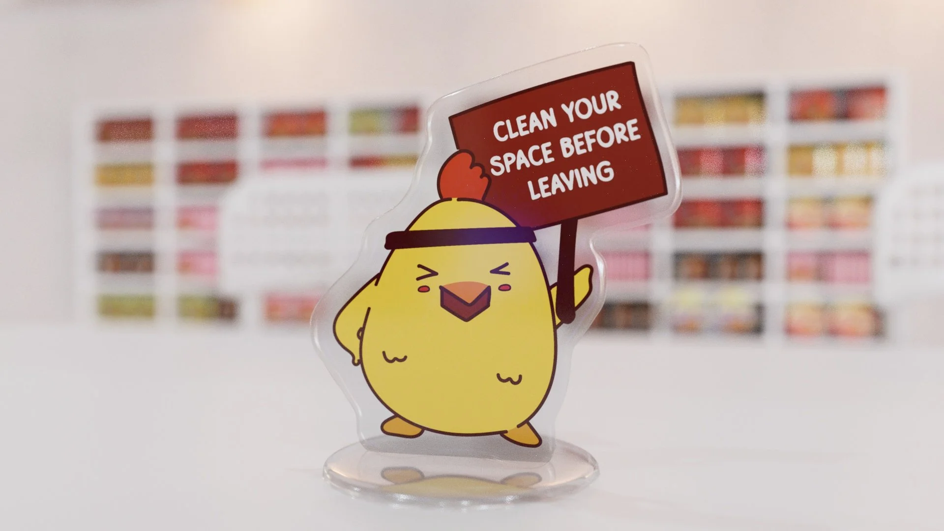
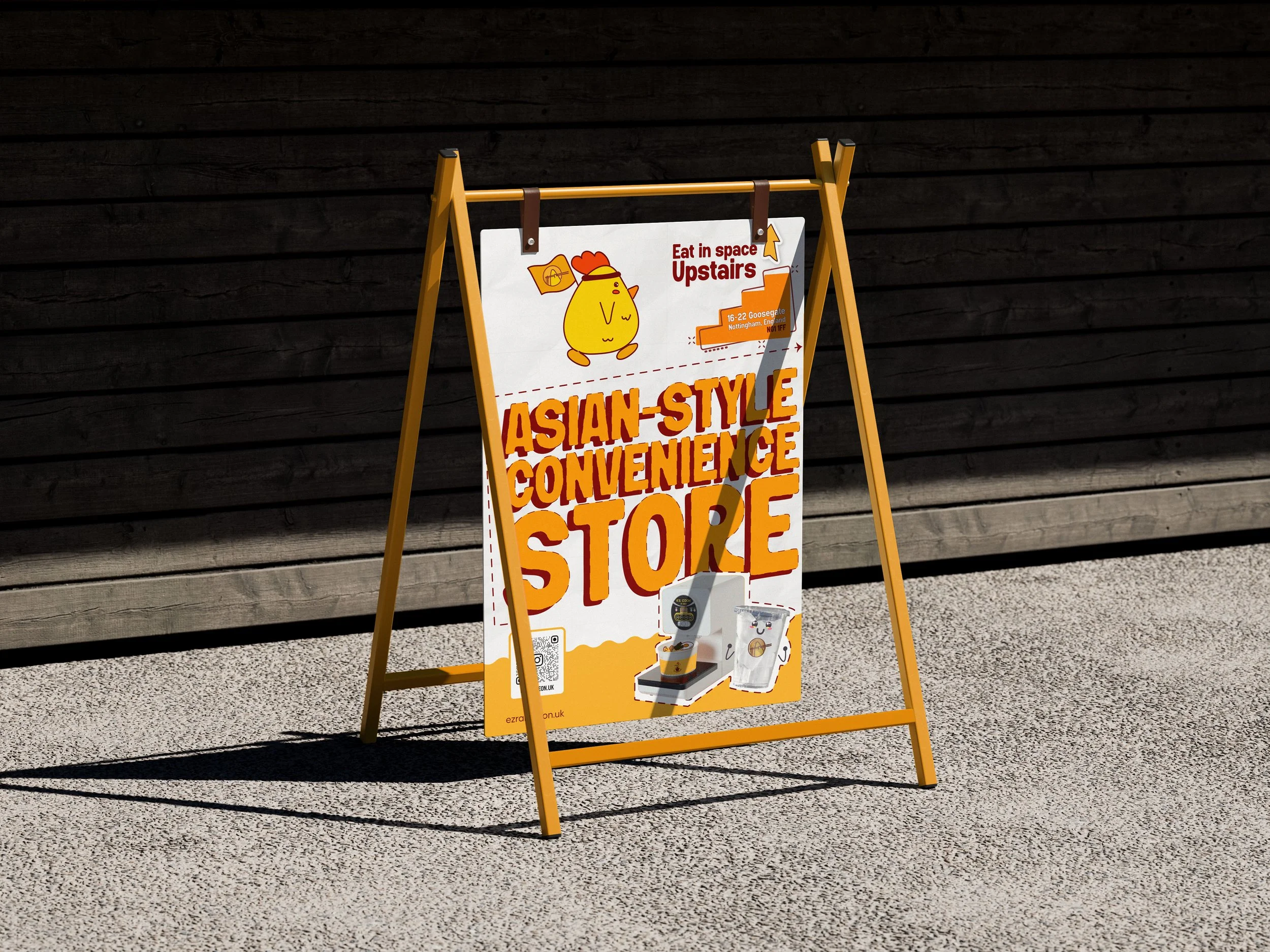
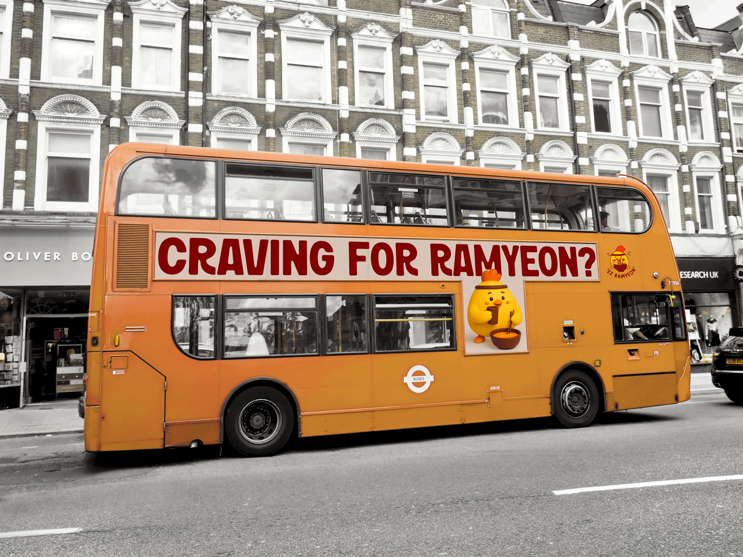
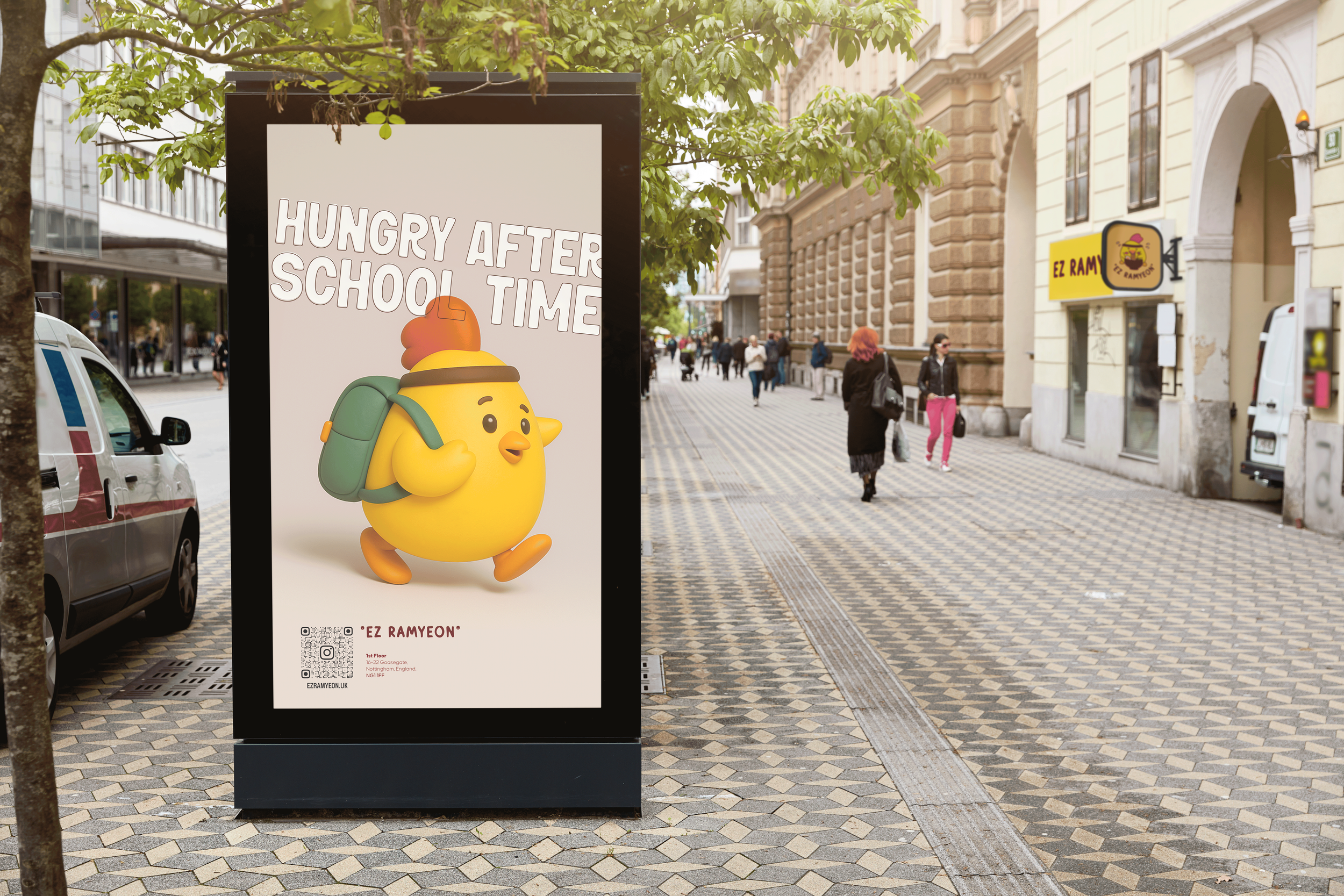
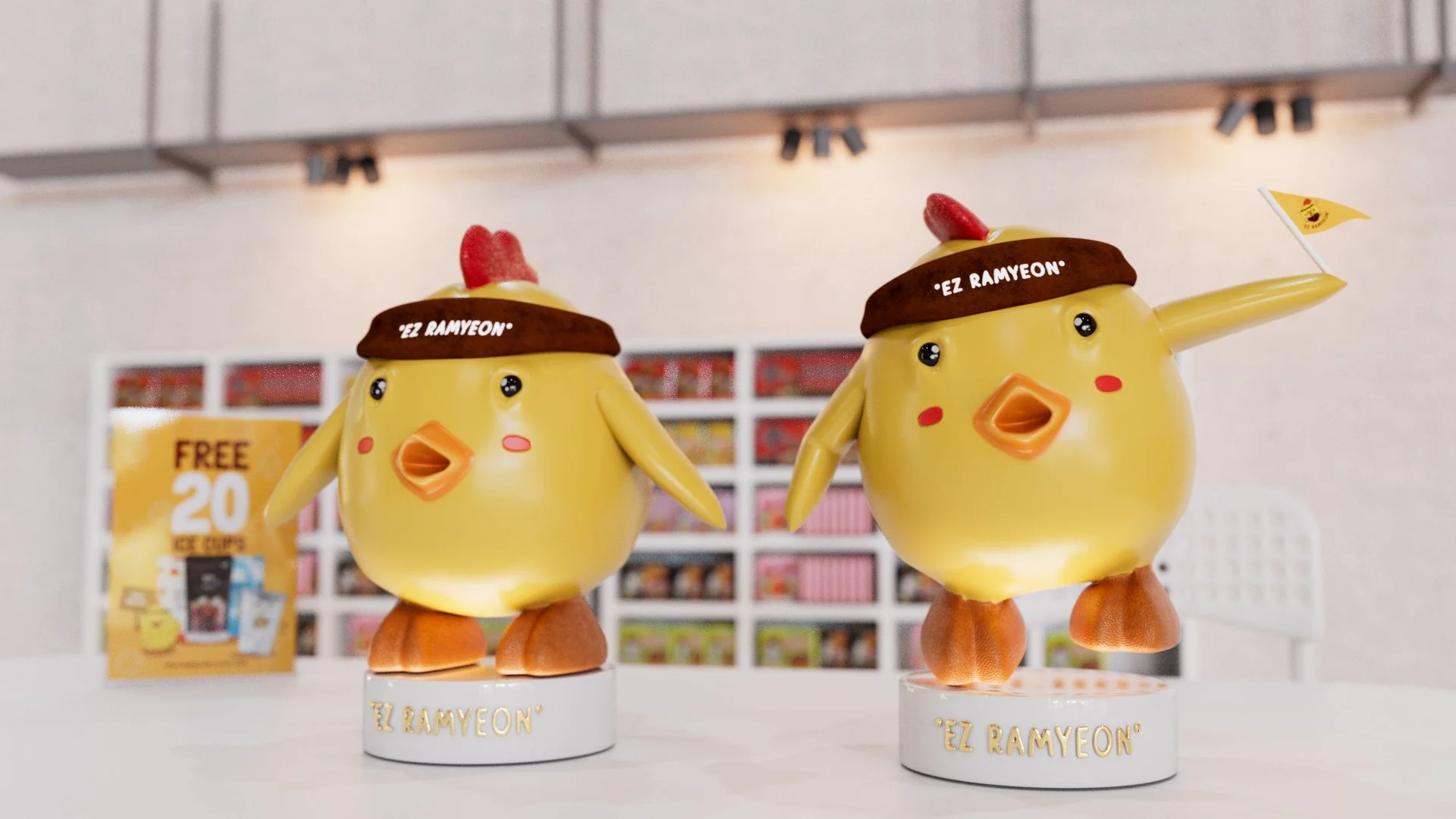
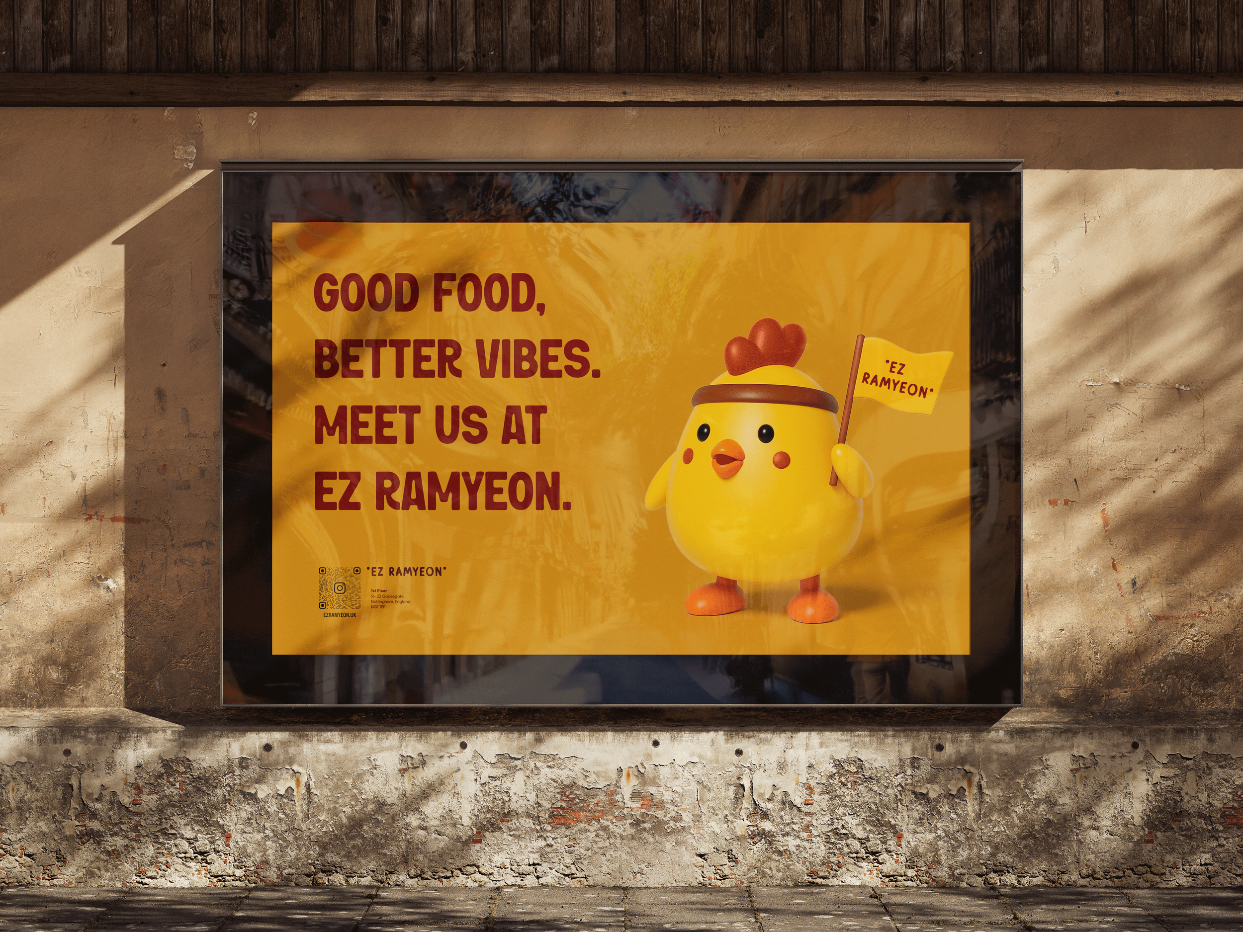
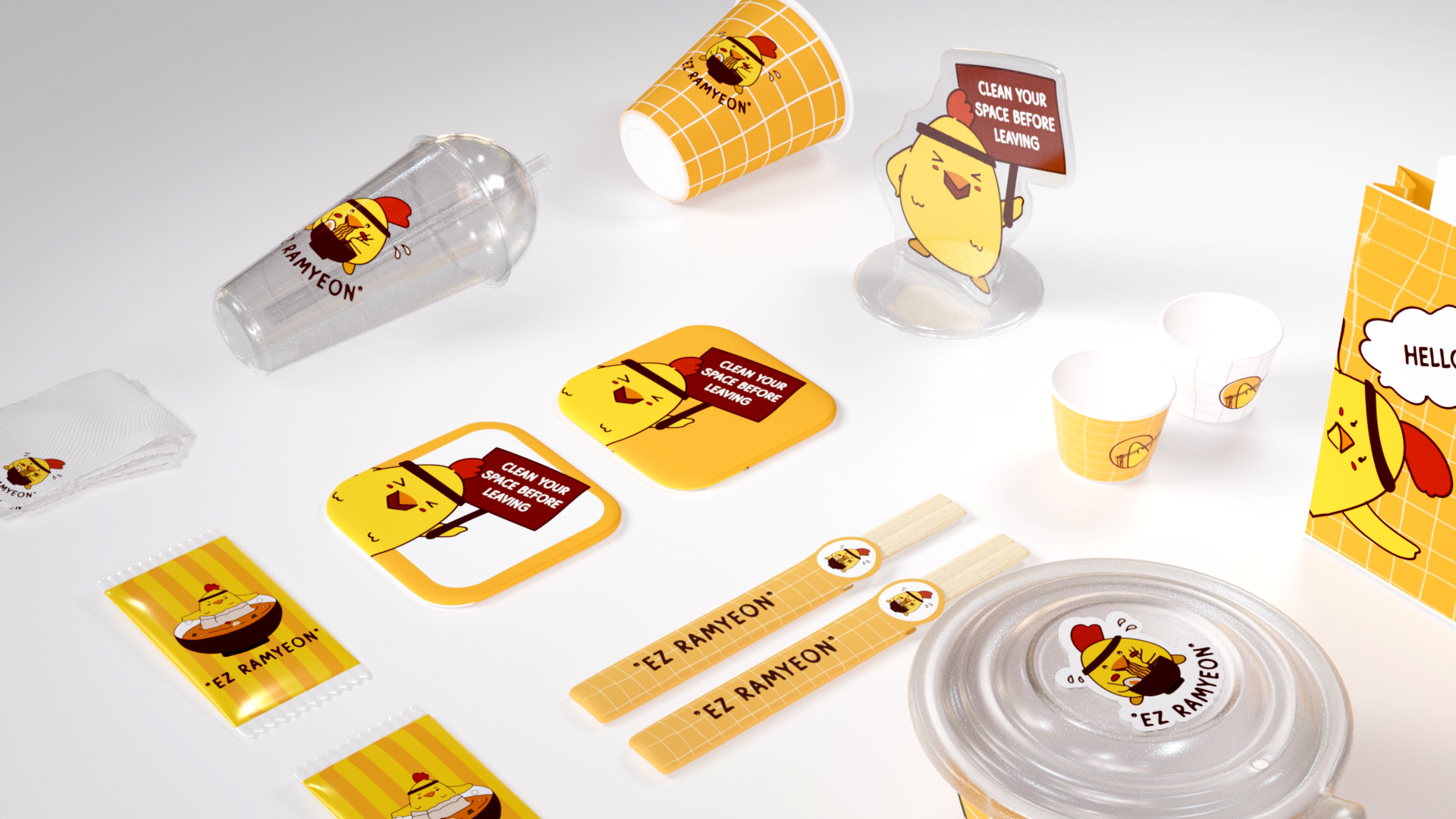
The branding for EZ Ramyeon, an Asian-style convenience store located in the heart of Nottingham, was developed to reflect a playful, approachable, and youth-oriented identity. Situated on the 1st floor at 16-22 Goosegate, the store features a self-serve ramen bar and a casual seating area, offering a relaxed space for students and locals alike.
The brand designer crafted a visual identity that combines hand-drawn illustrations with a cute and quirky aesthetic, aiming to resonate with the student demographic in Nottingham city center. With a friendly tone and vibrant, Asian-inspired elements, the branding brings a fresh, energetic vibe to the local food scene. The concept emphasizes fun, community, and creativity, turning EZ Ramyeon into more than just a convenience store—it’s a memorable destination.
Instagram: @ezramyeon.uk

neo creative studio
Designer: Tuyen Lam | 3D Artist: Tran Bang | Supported by: Shubham Gondurkar
Huyen Nguyen
Tina Thao Cao
Phuong Linh